|
|---|
これは日々の作業を通して学んだことや毎日の生活で気づいたことをを記録しておく備忘録である。
HTML ファイル生成日時: 2026/07/16 23:23:49.686 (台灣標準時)
Matplotlib を使って作図をするときに、 ax.plot () を使って点や線などを 描画すると、この線が下にきてこの点が上にきてほしいのに、逆に線が上で点 が下になっているでござる、と思うことがあるでござる。どうやら、 ax.plot () を使った順番に描画されているようで、先に ax.plot () を使って点や線 が下にきて、あとで ax.plot () を使った点や線が上にくるようでござる。
例えば、以下のような Python スクリプトで図を作ってみる。
#!/usr/pkg/bin/python3.9

#
# Time-stamp: <2022/10/13 07:58:53 (CST) daisuke>
#

# importing numpy module
import numpy

# importing scipy module
import scipy
import scipy.interpolate

# importing matplotlib module
import matplotlib.backends.backend_agg
import matplotlib.figure

# output image file
file_output = 'test_zorder_0.png'

# generating data for interpolation
data_x = numpy.linspace (0.0, 10.0, 11)
data_y = 2.0 * data_x + 3.0

# printing data_x and data_y
print (f'data_x = {data_x}')
print (f'data_y = {data_y}')

# making a function for linear interpolation
func_interp = scipy.interpolate.interp1d (data_x, data_y, kind='linear')

# getting Y-value for X-value at x=2.5
x1 = 2.5
y1 = func_interp (x1)

# printing result
print (f'func_interp ({x1}) = {y1}')

# getting Y-value for X-value at x=3.7
x2 = 3.7
y2 = func_interp (x2)

# printing result
print (f'func_interp ({x2}) = {y2}')

#
# making a plot using matplotlib
#

# making a fig object
fig = matplotlib.figure.Figure ()

# making a canvas object
canvas = matplotlib.backends.backend_agg.FigureCanvasAgg (fig)

# making an axes object
ax = fig.add_subplot (111)

# plotting data points
ax.plot (data_x, data_y, linestyle='None', marker='o', markersize=8.0, \
         color='blue', label='raw data')

# plotting result of interpolation
data_xi = numpy.linspace (0.0, 10.0, 1001)
data_yi = func_interp (data_xi)
ax.plot (data_xi, data_yi, linestyle=':', linewidth=3.0, color='red', \
         label='linear interpolation')

# plotting interpolated values
ax.plot (x1, y1, linestyle='None', marker='^', markersize=10.0, \
         color='cyan', label='result of interpolation #1')
ax.plot (x2, y2, linestyle='None', marker='v', markersize=10.0, \
         color='yellow', label='result of interpolation #2')

# labels
ax.set_xlabel ('X [arbitrary unit]')
ax.set_ylabel ('Y [arbitrary unit]')

# legend
ax.legend ()

# saving the figure to a file
fig.savefig (file_output)
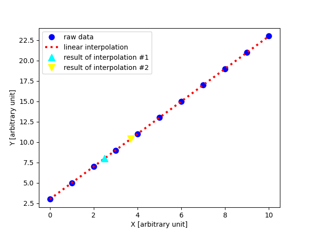
すると、以下のような図ができるでござる。
|
|
|---|
青い丸い点の上に、赤い点線が描画されていて、なんだか気持ちが悪いでござ る。まず赤い点線を描画し、その後で青い丸い点を描画するには、 zorder を 使えばよいようでござる。
#!/usr/pkg/bin/python3.9

#
# Time-stamp: <2022/10/13 07:58:47 (CST) daisuke>
#

# importing numpy module
import numpy

# importing scipy module
import scipy
import scipy.interpolate

# importing matplotlib module
import matplotlib.backends.backend_agg
import matplotlib.figure

# output image file
file_output = 'test_zorder_1.png'

# generating data for interpolation
data_x = numpy.linspace (0.0, 10.0, 11)
data_y = 2.0 * data_x + 3.0

# printing data_x and data_y
print (f'data_x = {data_x}')
print (f'data_y = {data_y}')

# making a function for linear interpolation
func_interp = scipy.interpolate.interp1d (data_x, data_y, kind='linear')

# getting Y-value for X-value at x=2.5
x1 = 2.5
y1 = func_interp (x1)

# printing result
print (f'func_interp ({x1}) = {y1}')

# getting Y-value for X-value at x=3.7
x2 = 3.7
y2 = func_interp (x2)

# printing result
print (f'func_interp ({x2}) = {y2}')

#
# making a plot using matplotlib
#

# making a fig object
fig = matplotlib.figure.Figure ()

# making a canvas object
canvas = matplotlib.backends.backend_agg.FigureCanvasAgg (fig)

# making an axes object
ax = fig.add_subplot (111)

# plotting data points
ax.plot (data_x, data_y, linestyle='None', marker='o', markersize=8.0, \
         color='blue', label='raw data', zorder=0.2)

# plotting result of interpolation
data_xi = numpy.linspace (0.0, 10.0, 1001)
data_yi = func_interp (data_xi)
ax.plot (data_xi, data_yi, linestyle=':', linewidth=3.0, color='red', \
         label='linear interpolation', zorder=0.1)

# plotting interpolated values
ax.plot (x1, y1, linestyle='None', marker='^', markersize=10.0, \
         color='cyan', label='result of interpolation #1', zorder=0.3)
ax.plot (x2, y2, linestyle='None', marker='v', markersize=10.0, \
         color='yellow', label='result of interpolation #2', zorder=0.4)

# labels
ax.set_xlabel ('X [arbitrary unit]')
ax.set_ylabel ('Y [arbitrary unit]')

# legend
ax.legend ()

# saving the figure to a file
fig.savefig (file_output)
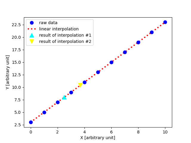
zorder を使って、描画の順番を指定すると、以下のような図ができるでござ る。 zorder で与えられた数が小さい順に描画されるので、下にしたいものに 小さな数字を与えればよいようでござる。
|
|---|
以下を参照するとよいようでござる。