Notebook
これは日々の作業を通して学んだことや毎日の生活で気づいたことをを記録しておく備忘録である。
HTML ファイル生成日時: 2026/07/16 23:23:49.686 (台灣標準時)
Matplotlib で作る図の縦横比
Matplotlib で図を作る際、図の縦横比を自分で指定したい場合があるでござる。
まずは、特に何も指定せずに以下のように作図してみるでござる。
#!/usr/pkg/bin/python3.9

#
# Time-stamp: <2022/05/18 09:05:44 (CST) daisuke>
#

# importing numpy module
import numpy

# importing matplotlib module
import matplotlib.figure
import matplotlib.backends.backend_agg

# output file
file_output = 'test_00.png'

# data
data_x = numpy.linspace (0.0, 20.0, 1000)
data_y = 0.5 * data_x

# making objects "fig" and "ax"
fig = matplotlib.figure.Figure ()
matplotlib.backends.backend_agg.FigureCanvasAgg (fig)
ax = fig.add_subplot (111)

# axes
ax.set_xlabel ("X")
ax.set_ylabel ("Y")
ax.set_xlim (0.0, 20.0)
ax.set_ylim (0.0, 10.0)

# plotting data
ax.plot (data_x, data_y, '-', label=r'$y=0.5x$')

# saving file
fig.savefig (file_output, dpi=225)
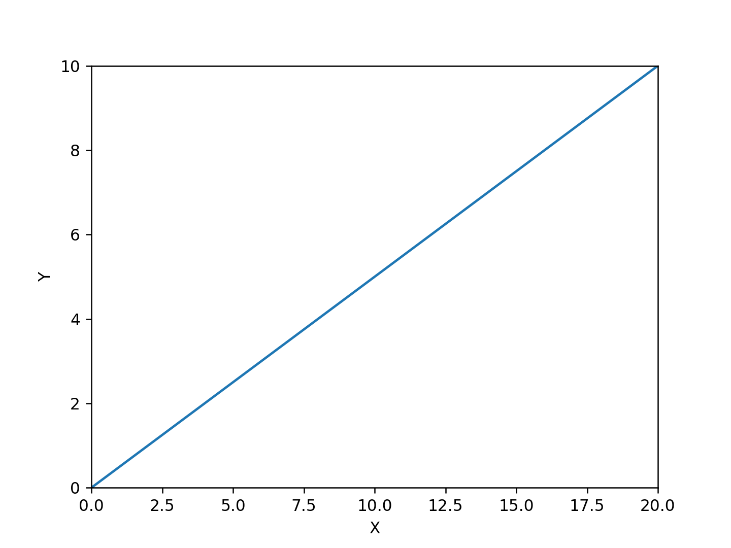
上のスクリプトを実行すると、以下のような図ができるでござる。 4:3 の縦
横比の横長の長方形の領域全体を使って図が作られるでござる。
次に、 set_aspect を使ってみるでござる。以下のようなスクリプトを用意し
てみるでござる。
#!/usr/pkg/bin/python3.9

#
# Time-stamp: <2022/05/18 09:06:51 (CST) daisuke>
#

# importing numpy module
import numpy

# importing matplotlib module
import matplotlib.figure
import matplotlib.backends.backend_agg

# output file
file_output = 'test_01.png'

# data
data_x = numpy.linspace (0.0, 20.0, 1000)
data_y = 0.5 * data_x

# making objects "fig" and "ax"
fig = matplotlib.figure.Figure ()
matplotlib.backends.backend_agg.FigureCanvasAgg (fig)
ax = fig.add_subplot (111)

# axes
ax.set_xlabel ("X")
ax.set_ylabel ("Y")
ax.set_xlim (0.0, 20.0)
ax.set_ylim (0.0, 10.0)

ax.set_aspect ('equal')

# plotting data
ax.plot (data_x, data_y, '-', label=r'$y=0.5x$')

# saving file
fig.savefig (file_output, dpi=225)
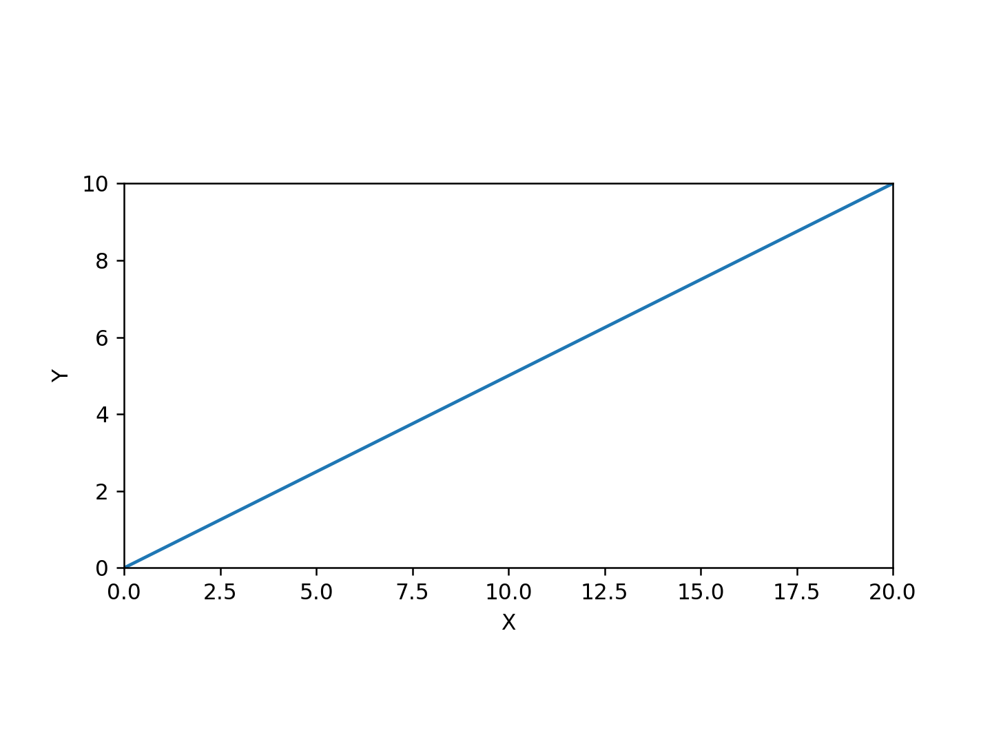
上のスクリプトを実行してみると、以下のような図ができるでござる。
set_aspect で equal を指定すると、 X 軸と Y 軸のスケールが同じになるで
ござる。つまり、 X 軸の 0 から 1 と Y 軸の 0 から 1 が同じ間隔で描かれ
るでござる。
スケールを同じにしたいのではなく、正方形の図を作りたいという場合もある
でござる。それには、以下のようなスクリプトにすればよいようでござる。
#!/usr/pkg/bin/python3.9

#
# Time-stamp: <2022/05/18 09:07:40 (CST) daisuke>
#

# importing numpy module
import numpy

# importing matplotlib module
import matplotlib.figure
import matplotlib.backends.backend_agg

# output file
file_output = 'test_02.png'

# data
data_x = numpy.linspace (0.0, 20.0, 1000)
data_y = 0.5 * data_x

# making objects "fig" and "ax"
fig = matplotlib.figure.Figure ()
matplotlib.backends.backend_agg.FigureCanvasAgg (fig)
ax = fig.add_subplot (111)

# axes
ax.set_xlabel ("X")
ax.set_ylabel ("Y")
ax.set_xlim (0.0, 20.0)
ax.set_ylim (0.0, 10.0)

ax.set_box_aspect (1)

# plotting data
ax.plot (data_x, data_y, '-', label=r'$y=0.5x$')

# saving file
fig.savefig (file_output, dpi=225)
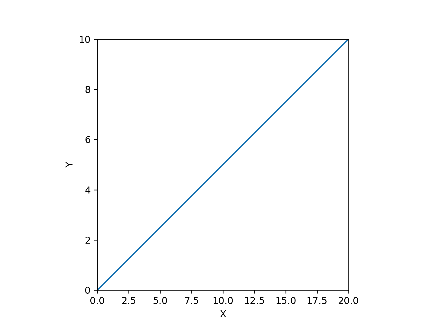
上のスクリプトを実行すると、以下のような図ができるでござる。 X 軸で表
されている範囲と Y 軸で表されている範囲は異なるのでござるが、図自体が
正方形になっているでござる。
- About this article:
- author: daisuke
- file: 20220518_0.html
- category: Computer___Python
- title: Matplotlib で作る図の縦横比
- mode: public
- last modified: 2022/05/18 22:01:47 (Taiwan Standard Time)
- html generated: 2026/07/16 23:23:49.686 (Taiwan Standard Time)
Frequently accessed files
- Computer___Network/20260127_00.html
- 3849 page views
- title: radiko の API に変更があった
- Misc___Taiwan/20240207_00.html
- 2985 page views
- title: 台灣から台灣の外に EMS で荷物を発送する方法
- Computer___NetBSD/20250301_01.html
- 2705 page views
- title: yt-dlp で YouTube の動画をダウンロードするときのこと
- Misc___Taiwan/20240819_00.html
- 2292 page views
- title: 住所から台灣の郵便番号を調べる方法
- Computer___TeX/20231107_00.html
- 1566 page views
- title: LaTeX での counter の利用方法について
- Book___Chinese/20240424_00.html
- 1542 page views
- title: 曹操の詩
- Computer___TeX/20240414_01.html
- 1238 page views
- title: LuaTeX を使って日本語と中国語の漢字が混在した PDF ファイルを作成する方法
- Misc___Japan/20240610_00.html
- 1153 page views
- title: NHK ラジオの「聞き逃し」の変更点 (2024 年 06 月)
- Computer___TeX/20240411_00.html
- 1146 page views
- title: LuaTeX を使って PDF ファイルを作成する方法
- Computer___Network/20241214_00.html
- 1115 page views
- title: Google Colab で Python 3.12 を使う方法
- Computer___TeX/20230726_01.html
- 1086 page views
- title: Beamer の Metropolis テーマで block の色を変える方法
- Computer___Python/20230803_00.html
- 1069 page views
- title: Python を使って QR コードを生成する方法
- Misc___Japan/20240718_00.html
- 1032 page views
- title: 日本の運転免許証が失効してしまったときの再取得の手続きについて
- Computer___Network/20230516_00.html
- 1002 page views
- title: OpenVPN 2.6 を使い VPN Gate に接続するときの注意点
- Misc___Taiwan/20240903_01.html
- 980 page views
- title: 台湾の郵便局で EMS を利用して荷物を海外に送る方法
- Computer___NetBSD/20230119_00.html
- 905 page views
- title: NetBSD でバイナリーパッケージを利用する方法
- Computer___NetBSD/20250113_00.html
- 875 page views
- title: TigerVNC での X server の解像度の指定について
- Computer___FreeBSD/20220621_0.html
- 857 page views
- title: FreeBSD での X.org の設定の仕方
- Computer___TeX/20240414_00.html
- 820 page views
- title: LuaTeX での fontspec を使ったフォントの設定の方法
- Computer___Network/20240130_00.html
- 786 page views
- title: Google Colaboratory で Python 3.12 を使う方法
- Computer___Python/20250330_00.html
- 735 page views
- title: Jupyter Notebook で Matplotlib を使うときのこと
- Computer___TeX/20240410_00.html
- 727 page views
- title: pdfTeX を使って PDF ファイルを作る方法
- Computer___NetBSD/20220818_1.html
- 727 page views
- title: Emacs の markdown-mode について
- Computer___NetBSD/20250307_00.html
- 689 page views
- title: uim と mozc による日本語入力の設定について
- Computer___NetBSD/20240805_03.html
- 684 page views
- title: NetBSD 10 のインストール
- Computer___Python/20240101_00.html
- 653 page views
- title: Matplotlib の 3D plot においての注意点
- Computer___TeX/20230503_00.html
- 651 page views
- title: LaTeX CJK で日本語や中国語を取り扱うための準備について
- Computer___NetBSD/20240101_03.html
- 643 page views
- title: ffmpeg で動画に metadata を追加する方法
- Computer___NetBSD/20220406_0.html
- 617 page views
- title: pkgsrc-wip に新たなパッケージを追加する方法
- Computer___Network/20220413_1.html
- 589 page views
- title: HTML 文書の中の一部の文字を点滅させる方法
HTML file generated by Kinoshita Daisuke.